JLA launches a new logo
- 16 July 2024
- 1 min read
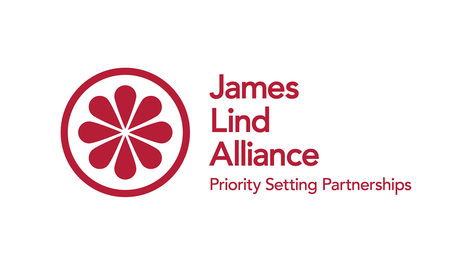
Today, we’re delighted to share a new, refreshed JLA logo with you.
The JLA has grown significantly since it was established in 2004 and we are proud to have an expanding reach both in the UK and internationally. With this in mind, we have developed a new logo which represents the inclusive and diverse ethos that is so central to the JLA. The modern, updated logo aims to reflect the values that sit at the heart of the JLA, appeal to the wide range of audiences that engage with the JLA, and continue to respect the JLA’s history.
It is important to us to maintain our association with the pioneering work of James Lind. By using a citrus fruit slice icon as the image within the new design, we feel that this acknowledges his work into the treatment of Scurvy.
At the core of the JLA are collaboration, equality and transparency. We believe that our new logo reflects these qualities, demonstrating the coming together of elements in a simple and effective design that maintains the link to our history and remains recognisable through the use of our traditional JLA colour.
There will be a period of overlap as we make the change to our new logo design, and we are contacting individual Priority Setting Partnerships about its introduction.
If you have any further questions regarding the new logo design and its launch, please contact us at jla@soton.ac.uk.
We hope you are as excited as we are about the new design.
The JLA Coordinating Team